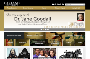
University’s homepage receives makeover

Screen Shot 2013-03-20 at 5.00.46 PM
Oakland University’s homepage got a facelift March 20 as Communications and Marketing unveiled the page’s first redesign in five years.
Director of Integrated Marketing Bryan Cain said a shift in content consumption on the Web prompted the makeover.
“Our users are expecting graphic representation, a less amount of text, more intuitive design, more interactive design,” Cain said. “We knew that it was time to get to that point or make this change based off of how the use of the Internet has evolved.”
The first change Cain pointed out occurs in the center of the page, what he calls the page’s “prime real estate,” a highlight of 10 major areas the university wants to focus on. The list includes applications, registration, academics, School of Medicine, library, athletics, undergraduate/graduate admissions, alumni and giving.
While the homepage redesign process has been in the works since November, Cain said plans for changes to the website have been in discussions since January of last year.
Online Media Specialist Colleen Campbell said the redesign of the sliders at the top of the page should really make a difference.
“They’re generally more prominent and you can just kind of cycle through them,” she said. “Before you had to just kind of wait for them to cycle through which I know most people probably didn’t do.”
Campbell, who also attended OU as a student in 2007, also likes the fact that the new homepage highlights campus events.
“We never featured events on the homepage before, at least not in my history here,” Campbell said. “I think that’s a big challenge for us as a university, is getting it known what’s going on.”
Changes to the admissions pages, OU-Macomb and First-Year Advising Center sites rolled out quietly earlier this year, and reveal a more graphical focus.
“We know that as we move into the world of Twitter, and Twitter has taken over our lives, people don’t read as much as they used to,” Cain said. “There’s far less text on this page, even when it comes to our news stories. Our news stories all now have a picture, along with a short headline and people have the opportunity to read more.”
Cain said the goal is to have each of the 471 websites under OU’s domain redesigned by the end of the year.
Interactive Designer and Web Developer Vadim Garber, the man in charge of the nuts and bolts on the back end of the website and making sure everything works together, said the change is mostly cosmetic.
“We have a content management system called CareWorks and that is what we use to manage our content,” Garber said. “What we did, and what you guys notice, is a graphical change and that mostly involves just moving some graphics around, changing some colors (and) setting up what we call style sheets to make sure everything looks uniform. Once we set up the template, all we do is essentially click a button, and things just get populated to the template.”
Garber said his two main concerns are user-friendliness on the front end and ease of uploading for the approximately 500 contributors providing events, news and content pages for OU’s website.


